Thursday, 20 March 2014

How to Write and Illustrate a Picture Book (Part 5 of 6)

Picture Book Illustrating Course Part 2
Composition and Narrative


Last week we looked at the importance of style and characterisation in picture book illustration. This week I'm going to waffle on about the other two things that make a winning illustration portfolio - composition and narrative.

The point of picture book illustrations are not (just) to add decoration to a written book, they’re there to convey not only the overall message and atmosphere of the book (style), but also, more practically, to tell the story. It is very rare that the words alone tell the story in a picture book - indeed often they don’t even make sense separated from the illustrations - the two work in tandem.

So part of the illustrator’s job is to decide which bits of the story need illustrating - what are the key moments, and then decide how best to portray that moment in a single frame - much like a film director - you decide on the angle of view, the composition, lighting and key action necessary to enhance and add to the drama of the narrative.

Composition

Most picture books are 32pages long - with end papers, title pages etc. that usually leaves 12-14 double page ‘spreads’ - so each story needs to be broken down to , say, 12 ‘scenes’ - but it's up to you how to ‘shoot’ the scene.

Practical things to bear in mind when composing your illustrations;
Size - ‘trimmed page size’or 'tps' is the final size of the page. Every publisher has 1 or two different standard page sizes their books adhere to - when putting together images for a portfolio measure a few books first to see what kinds of size/proportions are standard and work to those. An A4 -sized and proportioned piece looks amateurish.
Bleed - All publishers require the illustration to carry on outside of the tps, to allow for movement and discrepencies when the pages are being cropped and also to allow the designers to move your illustration around on the page a little if desired. If you're undertaking a commissioned piece the publisher will specify how much they require but it will be at least 5mm . They also won’t want any important elements within 5-10mm of the edge for the same reason.
Gutter; The crease down the centre of the spread - you MUST bear this in mind for your composition - there should be no detail on or too near the gutter.
Text placement - you must leave enough room for text - normally more than would allow the UK text as other languages take up much more room!
So... you have your text, your page size, your character sketches, now you need to plan your book out...


Storyboards
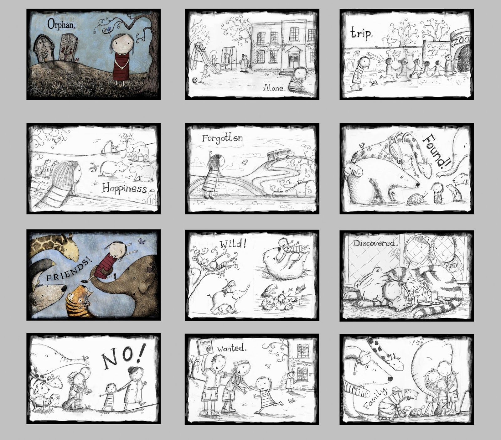
Storyboarding is essential part of planning a picture book. Telling a story in 12 spreads is an art that requires you to tie the elements of pace, composition and colour together - storyboarding makes that possible and lets you see at a glance how to improve these elements.

Can be very rough and sketchy or very detailed - everyone works differently but the storyboard is the time to try out different compositions, different text placements, pacing, even colour schemes.

Basically, draw 12 rough rectangles for your 12 spreads and start sketching up rough ideas for compositions on each spread, eg.

Use this method to try different compositions for the same spread;


So what makes a good composition?


- Visually appealing
- Helps (rather than hinders) the narrative
- works with the text
- makes good use of the space allowed - including white space, the gutter,
- Varied within the book - close-ups, different angles, viewpoints, full page scenes or small spot illustrations or 'vignettes'
- Action - not static - either emotion or action conveyed to the reader. Nobody wants to see two character in conversation for spread after spread in a book. Vary it. If there's no excitement in the text, create some in the illustrations.
Try to get movement, action and exaggerated emotions into your spreads - and try to get accross what is happening with or without the text. I hope this 'submarine poop' spread from 'Mr Poopy Pants (Lion Hudson, due out in June) speaks for itself!

But much like when we looked at what makes a good picture book text the answer really only lies in other successful books, pouring over them, really looking at what makes the artwork work so well, when you do this you'll start to learn what works and what doesn't.
Never underestimate the use of colour - in my forthcoming book with Lion Hudson, 'Missing Jack' a difficult subject of the death of a pet is covered so on this spread, the saddest in the book, I wanted the colours to be very muted and the elements on the page to be sparse. Later in the book when  Toby starts to accept a new pet into his life the colours  pick up again, matching his mood.


Narrative
When  potential publisher looks through your portfolio one of the things they're looking for is great storytelling ability. Without reading the text can they already get a sense of the characters, emotions,  plot from your illustrations alone? Do your illustrations add more story to the text than was there to start with? Hidden depths for children, particularly older readers, to discover?

Two new spreads from Fat Fox book 'Happy Hooves' due out later this year. Both spreads are set in the same spot but I wanted to vary the colours of the background from spread to spread so that the book didn't feel static so in the second spread I've used patterns and colours from the pig character, the star of this scene, to colour bits of the background, I've also taken a drastically different 'camera' angle from the first spread to frame the scene. Artistic license is what it's all about in children's book illustration!

Activity
Draw 4 rough wide rectangles on your page with a line down the middle to denote the gutter.  Pick a random scene from this list and sketch out 4 different versions of it. Which works best? Why?


Homework
Work up a finished spread - can be a character or text you’ve been working on, something fro the list above, or a classic nursery rhyme or favourite book from your childhood (think 3 little pigs, Little Red Riding Hood, Goldielocks,  etc... but maybe with modern spin!) 

Remember to;
design your characters first
plan your composition first - think how you could improve it
do a pencil rough before going to colour

Extra homework if you have time.... storyboard an entire book - again, either your own or a classic, think in terms of 12 spreads.


NEXT WEEK: How to put together a plump, beautiful and irresistible portfolio and market your work to needy greedy publishers.

Sunday, 9 March 2014

How to Write and Illustrate a Picture Book Part 4 (of 6)


Picture Book Illustrating Course Part 1
Style and Characterisation


Ok so it's been a bit more than a week since our last session but obviously that's because I'm such a warm and understanding teacher I just knew you'd want a little longer to complete your last homework assignment and take in everything so far...

it has nothing at all to do with the fact that I forgot... a-hem...

and I've been busy working on new projects, like this;


Anyhoo, on with the lesson... quiet at the back...

We’ve spent the last three sessions looking at writing children’s picture books and now we’re going to concentrate on illustrating picture books - whether or not you intend to write them as well. In just three sessions I won’t have time to go into specific techniques and I can’t hope to cover an entire degree course but hopefully it will give you a good starting point from which you can develop your own work.... I’m completely self-taught (my degree was in Philosophy - not a natural path into book illustration!) and I believe that, as with writing,  if you begin to know your field and know what works and what publishers are looking for you can, with time, patience and a whole load of practice,  you can hone a more self-critical eye and start to shape your own work into something a publisher would be desperate to get their hands on.

Illustrating children’s picture books is a slightly less competitive field than writing children’s picture books as the skill set is more specific - you have to be able to draw! Where as with writing, everyone can string together a sentence so it’s not such a leap to believe you can write a book, with illustrating people tend to know whether they have artistic skills or not and would only pursue such a career (one would hope) if they do. I’m presuming in his course, therefore, that you have some kind of artistic skills to begin with! If not, take a basic beginners art course and learn to draw first.

BUT whilst it is not quite as competitive as writing them, illustrating picture books  is still an inCREDibly competitive field with hundreds of graduates churned out each year from illustration degree courses all with one aim - to get published! What I believe is sometimes lacking, however, in illustration degree courses is the knowledge on how to actually mould your work into something commercial enough for a publisher to want but unique enough to get noticed.

There are 4 things publishers are looking for in illustration samples; great....

Style            - what your work looks like! medium, feel etc.
Characterisation    - strong appealing characters
Composition    - using the page and text/image placement to best affect
Narrative        - telling the story through pictures

This week we’re going to look at Character and Style, next week Narrative and Composition and in the final week we’ll look at practical tips on what a publisher wants to see in a portfolio, how to send off samples, what to do when you get your first commission etc.


Style
- To be successful you need to develop a style that is original and instinctive.
- It's impossible to say what publishers are looking for at any one time but suffice to say they know it when they see it!
- Rather than setting out to impress find a style that comes naturally to you.
- Look at your own abilities and find out where your strengths lie and perfect that style
this comes over time - you can’t force it - and it’s not going to happen in three weeks!

Activity
It is arguably impossible to become a great artist without first studying the greats so your ongoing homework is to spend time in libraries/book shops/on line looking at what’s currently out there... not with a view to copying them but to know what you’re up against and the standards expected. Your work needs to be as good, if not better, than what is currently on the shelves if it is going to stand a chance of being published.

When you look through these books do NOT read them at first, instead try to just look at the images and consider the following;
- style, characterisation, medium, narrative, composition etc. And if you can, fill out (or at least think about) the attached question sheet with each book so you really start to learn what makes good book illustration and why.

How to find a style??
- Use a sketch book and sketch freely with no particular style in mind - popular styles are often those that retain that fresh instinctive flow captured in sketchbooks.
- sketch children and animals
- go to the zoo! Great place to come up with new characters.
- Start off sketching a subject accurately then condense that sketch down over and over again to something more characterful and less fussy. Try different eyes, expressions, clothing, exaggeration of elements, softening lines such as an elbow into something more fluid... whatever works... just experiment
- analise your sketches to see what you do best and build on that. Then try to colour up a sketch in whatever medium comes naturally to you
- don’t try too hard - don’t view the final artwork’ as something separate from what you do when you sketch or doodle as you can run the risk of over-working your final piece and making it static.
- Think about what medium to use - what will come naturally to you.This could be...

- Line and wash (gouache,  water colour, acrylic etc. This is traditionally the most widely used style.)
(Chloe and Mick Inkpen's 'Zoe and Beans')

- Thicker paint - acrylic,oils
(My book 'Milo's Pet Egg', acrylic)
- digital
(Spread from my as yet unpublished work  ' Jungle Mumble' - Illustrator and Photoshop )

- pastels


(Tina MacNaughton 'Snuggle Up Sleepy Ones')
- collage, mixed-media

(Lauren Child 'I will Not Ever Eat a Tomato')
- coloured pencils

(Raymond Briggs 'The Snowman')
- a mixture of the above - anything goes really it’s the end result that matters not the journey getting there!

When you've found your medium practice, practice, practice! You can only get better.

Characterisation

Character Development
- A successful character must charm and intrigue readers.
- Not necessarily cute, but certainly visually appealing and attractive in some way
- The main character will probably be on front cover and publishers are always thinking about the possibility of merchandising, licensing, tv rights etc. which are always looking for interesting, loveable, eye-catching new characters.
- Again, start with your sketch books - there are a million ways to draw a pig, a cat, a boy, find a way to make yours unique.
- EYES are very important!! Look at other artists to see how they draw eyes.
- Think not only about your characters looks but about his or her personality and how that can be conveyed in your illustrations.

(One of MANY pages from my sketchbook playing about with characters for my book 'Missing Jack'. Here's the final cover illustration;)


ACTIVITY
Come up with a monster character. - think cute, appealing, fun, funny.... fill a couple of pages with different monster sketches, don't stress over each one too much, just loose initial ideas. Then choose one of your monsters and draw/trace his outline over and over and experiment by drawing the eyes differently on each one, dots, large circles, realistic eye shape, close together, far apart, large, small etc. etc. and see what works for you.

Character Consistency
One of the main skills needed in a book illustrator is to be able to not only design a great engaging, appealing character but to then be able to draw it from different angles, doing different activities, with different emotions and in a variety of settings all the while keeping it consistent and believable. This takes a lot of time and practice! So get practicing.

Character sheets
Often publishers will ask to look through your sketch books just to see if there’s any possible characters to work on, and then they may ask for a character sheet - either the same character in different positions, or with slight variations such as different eyes etc.)
(A fox character sheet from a previous book of mine.)


Homework - Come up with 2 character sheets.
One with different possible ways to draw the same character, like your monster,  (chose a character either from the book you’ve written, or a made up book, or an existing tale) and
another with your chosen favourite character from the first sheet in different positions like my fox sheet above, - front, back, side, jumping, sitting, from above, walking, dancing etc. etc.! Give your character a name and a sentence or two on his personality.


Enjoy. And come back next week when I’ll be banging on about composition and narrative.


Blogging tips